The Big Book of Dashboards presents a comprehensive reference for those tasked with building or overseeing the development of business dashboards.
Upcoming Workshops
Learn how to build world-class business dashboards from leading experts in the field of data visualization.
A well-designed dashboard can point out risks, opportunities, and more; but common challenges and misconceptions can make your dashboard useless at best, and misleading at worst. This workshop will discuss the tools, guidance, and models you need to produce great dashboards that inform, enlighten, and engage.
Steve Wexler and Jeff Shaffer bring years of hands-on experience helping people in hundreds of organizations build effective visualizations. They have endured many “best practices” battles and bring an uncommon empathy that will help workshop participants survive and thrive in the data visualization world.
Agenda
Introduction and Fundamentals of Data Visualization
Data Representation and Visualization Types
Visualizing Time
Data Visualization Best Practices
The Use of Color in Data Visualization
Fundamentals of Dashboard Design
Interactive Visualizations
Engagement through Personalization
Advanced Dashboard Design
Dead-End Dashboards
Thinking Critically about Data
Dealing with the Real World
Workshop attendees will receive a copy of The Big Book of Dashboards.
What People are Saying about the Instructors
Read Ken Black's Review of the Atlanta Workshop
“I attended your training in Atlanta earlier this year and it drastically changed how I design dashboards. I’m hiring a junior analyst and would like to send him as well. ”
“...very knowledgeable - definitely an expert in his field.”
“Brilliant with communication and instructions.
Gave examples and described situations very well.”
“… kept energy and interest levels high, exhibiting charisma, passion, and patience in his approach. He also went the extra mile to point me in the right direction in fleshing out a complex data visualization after the class had ended.”
“Amazing knowledge and he is well versed with the subject.”
“I had such a great experience and can’t recommend it enough!”
“I've attended around 15 training courses in my professional career and this was the best instructor I've had. His patient and polite manner really cultivated a positive atmosphere for absorbing knowledge.”
“He has a real desire to teach others what he knows,
and is incredibly generous with his time and knowledge.”
“It was an opportunity to learn at the foot of a master.”
Instructors

Steve Wexler
Data Revelations
Steve Wexler has worked with ADP, Gallup, Deloitte, Convergys, Consumer Reports, The Economist, ConEd, D&B, Marist, Tradeweb, Tiffany, McKinsey & Company, and many other organizations to help them understand and visualize their data. Steve is a Tableau Zen Master, Iron Viz Champion, and Tableau Training Partner.
His presentations and training classes combine an extraordinary level of product mastery with the real-world experience gained through developing thousands of visualizations for dozens of clients. In addition to his recognized expertise in data visualization and Tableau, Steve has decades of experience as a successful instructor in all areas of computer-based technology. Steve has taught thousands of people in both large and small organizations and is known for conducting his seminars with clarity, patience and humor.
DataRevelations.com
@VizBizWiz

Jeffrey Shaffer
Data Plus Science
Jeffrey A. Shaffer is Vice President of Information Technology and Analytics at Recovery Decision Science and Unifund. He is also Adjunct Professor at the University of Cincinnati teaching Data Visualization where he was the 2016 Outstanding Adjunct Professor of the Year.
He is a regular speaker on the topic of data visualization, data mining, and Tableau training at conferences, symposiums, workshops, universities, and corporate training programs. He is a Tableau Zen Master, was the winner of the 2014 Tableau Quantified Self Visualization Contest which led him to compete in the 2014 Tableau Iron Viz Contest. His data visualization blog was on the shortlist award for the 2016 Kantar Information is Beautiful Awards for Data Visualization websites.
DataPlusScience.com
@HighVizAbility
Broad Application
Healthcare
Scheduling, patient tracking, worker's compensation claims, and health care provider productivity monitoring.
Customer Service
Call center dashboard, complaint monitoring, now vs. then comparisons and customer churn.
Marketing
Website tracking, resource utilization and sentiment analysis.
Sports
Team performance analysis and player performance rating.
AUTHORS
CONTRIBUTORS
DASHBOARDS
PAGES
Real-world examples

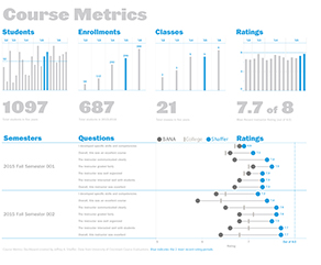
Course Metrics Dashboard
This dashboard monitors the metrics of a course at a university.

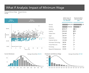
What-If Dashboard
What-If Dashboard that analyzes the impact of increasing the minimum wage within an organization.

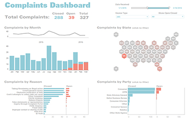
Complaints Dashboard
A dashboard used to monitor consumer complaints by channel that are open and closed.